Why is building a website so hard?

I’ve been working in technology startups for several years now and I’ve been up close and personal with what it takes to get something designed, built and onto the internet.

During the consulting parts of my career, I helped build plenty websites for clients. But it’s a whole different ball-game when you are in-house and personally responsible for whether or not the site is delivering results. I’ve found that as soon as you’re responsible for the actual business results, your whole mindset towards building digital products changes. For example, I’ve found that all of a sudden usability and simplicity become more important than how things look for their own sake.

I’ve always been fascinated by how things that seem like a nice easy website project can gradually become complex, stressful and expensive. It’s not just the normal “things take longer than you’d expect” effect from all types of project management. Something more profound is going on when building digital products. There are several interesting issues that cause website projects to be harder than you’d expect: Continue reading Why is building a website so hard?

Marketing Channels: PR vs. Advertising vs. Design

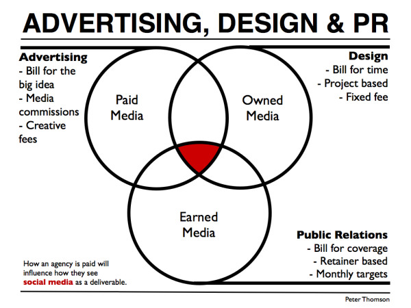
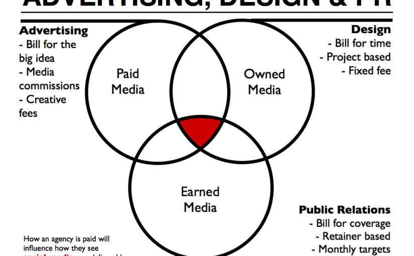
Advertising, design and public relations all have something useful to contribute to social media. But they come from very different worlds and they each have hidden biases. Customers just experience the end result, but the way a company builds their reputation can be secretly swayed by the type of agencies that a company hires to help out with their social media. Owned, earned and paid media all add up to an overall impression of the brand.

Ad v design v PR
The business model of different agencies influences their approach to social media briefs.

I arrived in London at the height of the global financial crisis. Back then no one was hiring for Brand Strategists because it’s not a good look to do a new logo when you’ve just laid off 10,000 people. And it’s definitely not a good look to do a management workshop about the meaning of life to then choose the colour of the new logo when you’ve just laid off 10,000 people. So brand strategy (and in particular, the management consulting style brand strategy that I was most experienced in) had fallen off a cliff.

Continue reading Marketing Channels: PR vs. Advertising vs. Design

Innovation Warehouse 8: Design Process

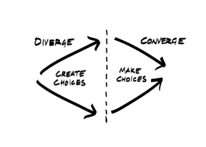
Creating a new brand identity can be a chaotic experience. Having a robust design process makes it easier to keep moving when the going gets tough.

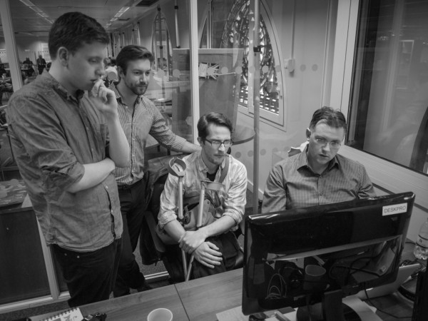
Design Team Crit Review
The design process allows an entire team to work together coherently.

Some clients are easy to create a brand for because they already know who they want to target and what they want to say. But most clients have a surprisingly high degree of uncertainty about their strategy, messaging and design. We use lean branding to iterate and improve the brand as we go, but we still need a critical path design process to help us stay focused.

Continue reading Innovation Warehouse 8: Design Process

Innovation Warehouse 5: Design Research

Competitor research is a powerful link between the strategy and design phases of a rebranding project. The design team need to understand the visual landscape in which the new brand will exist. The new brand needs to be sufficiently different from existing brands in the marketplace. Understanding the visual landscape helps both the client and the design team get a feel for the competitive space. The first step in understanding the playing field is design research.

London Startup Accelerators
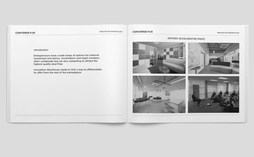
The new Innovation Warehouse brand needs to reflect a unique point of view.

Our design research for the Innovation Warehouse is intended to make sure that the final brand designs are sufficiently different from the competitors to be memorable and interesting for the audience. We’ve made our research documents available for download as part of the open-source case study approach that the Innovation Warehouse are taking to the rebranding project. Continue reading Innovation Warehouse 5: Design Research

Innovation Warehouse 2: Brand Audit

Stage two of the Innovation Warehouse rebranding is to audit the existing brand. We have been asked by the Innovation Warehouse team to share the process publicly so that the community can have input and so that other startups can learn from the experience. Personally, I find that the brand audit is always a slightly touchy phase because it’s early on in the relationship and we’re still getting to know the client. For the process to work, we have to be brutally honest and hold a mirror up to the client and show them what they look like from a customers’ perspective.

Visual Audit Case Study
We have to be totally honest with a visual audit so that it’s a platform to build on.

The full brand audit (warts and all) is included below with permission from the Innovation Warehouse to help make the branding process more open (and to allow other startups to learn from the process). Some of it is complimentary, some critical and some harsh. But it’s all in the interest of building a solid platform for the new brand. This article is a summary of the management team meeting where we presented the findings of the brand audit. We had identified the key priorities during the briefing in Stage One.

Continue reading Innovation Warehouse 2: Brand Audit

Creating a new product category

Creating a new category is the aspiration of every enthusiastic entrepreneur. Most business people would love to have a whole category all to themselves. The dream is that if you could be the “only” player in your category, then you could charge whatever you liked and sell an unlimited volume.

In practice, creating a new category is incredibly hard. In fact, it may be the hardest form of branding that any company can undertake. For most companies, it’s hard enough to explain what your product does (and how it’s different to your competitors’). The task of explaining the entire function of a new product category can be too much for many companies to bear.

Continue reading Creating a new product category

Brand strategy for startups

Brand strategy is the foundation of all good marketing, advertising and PR. A good brand will help you win customers, raise capital and attract co-founders. You need a minimum viable level of clarity to move fast and adapt your brand as your startup evolves.

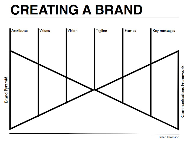
Recently I’ve been helping more startups and entrepreneurs with their initial brand creation. What I’ve found is that the challenges that you face starting your own brand are surprisingly similar to the work that I do rebranding multinational companies. A few years back, I put together a new framework for creating a brand strategy. It’s called the Brand Bowtie because it puts together an internal brand architecture pyramid with an external communications pyramid.

Brand strategy for entrepenuers
A fashion entrepreneur faces many of the same branding challenges as a multinational company.

The elements of a successful brand are a vision, values, attributes, tagline, stories and key messages. The internal brand architecture is your little secret, but it will inform everything that you do. The external communications framework is an external tool that you can pick and mix from to build websites, social media and marketing collateral.

Continue reading Brand strategy for startups

The difference between marketing and design

Marketing and design a very different mindsets and professions. I’m guessing that both your company’s marketing and your design probably sucks. But then again so does everyone else’s. It’s been driven to blandness by a combination of focus groups that couldn’t “get” your new idea, repeated changes from your management team, internal squabbles and old ideas left over from a time when advertising spend equalled market success. But maybe there is an even deeper problem…

What's the difference between design and marketing
The difference between marketing and design is the focus on the end-user as an individual.

The difference between marketing and design isn’t obvious. They’re different professional disciplines but the real difference is in the mindsets that they bring to approaching a problem.

Continue reading The difference between marketing and design

Metrics to help you build the case for design

The big consulting firms (McKinsey, Booz Allen and BCG) would all love to get you to use more metrics to analyse innovation. Partly because it allows them to apply their existing left-brain analytical skills to your right-brain creative design challenges. Everyone has their own take on the role of metrics in design. Whatever side you take there is a lack of easy metrics that you can use to quickly explain to your CEO and CFO why design is important to your company’s growth.

Below are the top 5 metrics that you can pick up today to benchmark your business against your competitors. These are not the only metrics but they are the ones that you’ll be able to use to make a strong case for investing in design:

1. Vitality Index

Sales from products created in last 3 years / Total sales

2. Contribution margin

(Sales – Direct costs) / Total sales

3. Return on assets

Net profit before tax / Total assets

4. Brand value

Expected net annual cashflow from your branded products / Your target annual return on investment percentage

5. Return on intellectual property

Total sales / (Market capitalisation – Physical assets)

Warning, these are not measures that you will be using to manage your design process. Later on, we’ll cover metrics such as delivery in full on time as specified (DIFOTAS), Return on innovation investment (ROII), Time to market (TTM) and a whole host of activity measures.

Next week we’ll calculate the numbers for these metrics for a couple of example companies so that you can compare your own performance.

Slides to help you build the case for design

Frog Design, Ideo, Stone Yamishita
I’ve learned a lot about presenting complex ideas from watching how design firms pitch themselves.

Powerpoint is a dangerous tool. Nevertheless, it’s useful to see how the top design and innovation firms describe what they do. Below are examples of how these design and innovation firms present to a general business audience. A couple of them were made for specific events so don’t get too distracted by the detail.

You can certainly take your time with them but the goal is to absorb an overall picture of what would work for yourself to use as a tool in describing your own work to your CEO, CFO, engineers and even the marketing team.

Adaptive Path: Subject To Change: creating great products and services for an uncertain world


Frog: Design In The Age Of Convergence

Ideo: Design Thinking

Stone Yamashita: The Worlds Largest Innovation Lab

Each of these presentations is a different take on the core issue of how we describe end-user centred design, design processes and design thinking to a business audience. Which do you feel are the best and worst?