After several rounds of review, we’ve completed the design system for the Innovation Warehouse. The new design is based on the insight that starting a business is one of the most intense things that any person can do. An entrepreneur is looking for both the freedom to do their own thing and the support of having a peer group.
We’ve created a design system that reflects the brand values, product architecture and company aspirations of the Innovation Warehouse. It’s also focused on the end-user journey and prioritised according to the business model. One of the main project goals was to help launch the new angel investing and startup accelerator offerings.
Grid system
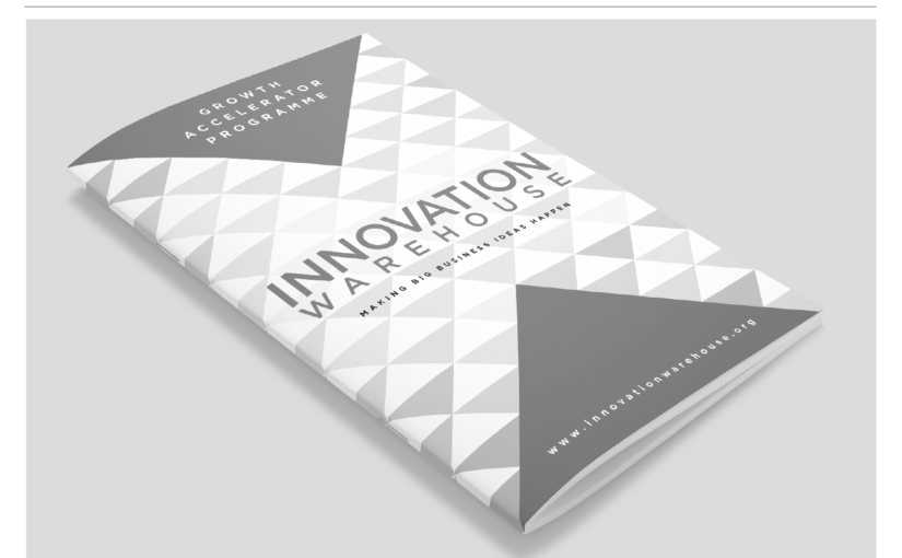
The grid system that we’ve created for the Innovation Warehouse uses squares bisected to create triangles. These triangles are sometimes used as a background pattern and sometimes combined to form large triangles in the foreground.
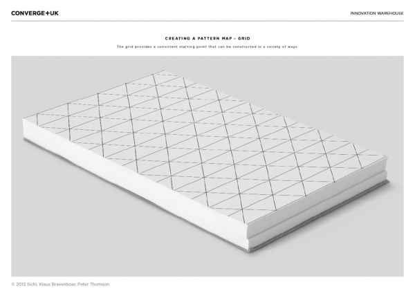
The most important feature of the new design system is that it can be used in many applications in consistent way (without resorting to just slapping a giant logo on everything). The Innovation Warehouse design system needed to be flexible enough to be applied by non-designers and to survive regular iterations and alterations.
Design story
The brand design process was built on the brand strategy but really focussed on bringing the key messages to life in a visual way. We used mood boards to help find some visual metaphors for growth, innovation, structure and chaos.
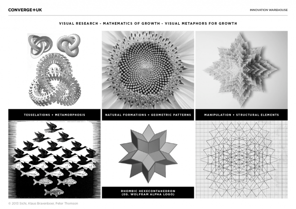
You don’t need to be overly literal with your design inspirations. The mood boards and reasoning behind the design are part of the journey, but don’t need to be over explained. The inspirations, benchmarks and mood boards are useful internally but the work should stand on its own without too much background justification.
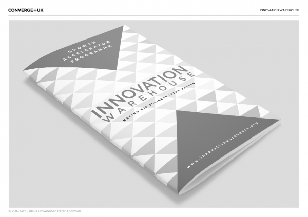
Getting feedback on a new brand design is like a giant crowdsourced Rorschach Ink Blot test. Everyone has an opinion on graphic design and any shape can look like anything if you stare hard enough. During early feedback on the Innovation Warehouse project we received had various anatomical interpretations of the triangles and questions about whether the triangles should point upwards to represent growth.
System elements
Beyond the brand values, the brand also needs to be fit for purpose as a tool of persuasion. We have optimised the different brand elements of the Innovation Warehouse for different purposes:
- Wordmark is optimised for readability to encourage word of mouth.
- Social media avatars are optimised for recognition and uniquneness.
- Repeating pattern triangles are optimised for subtlety to provide a consistent environment without shouting.
- The large coloured triangles are optimised for brightness to convey strong messages to new audiences.
The design system document covers the work in progress stages as well as a summary of the recommended design system. There will still need to be brand guidelines created as part of the final stage.
We’ve made the entire design presentation available for viewing and download as a part of the Innovation Warehouse’s commitment to transparency and contributing to the startup community.
Concepts applications
The best way to build a brand design is by applying the ideas to real-life collateral. We’ve created mockups and test applications for the Innovation Warehouse throughout the design process.
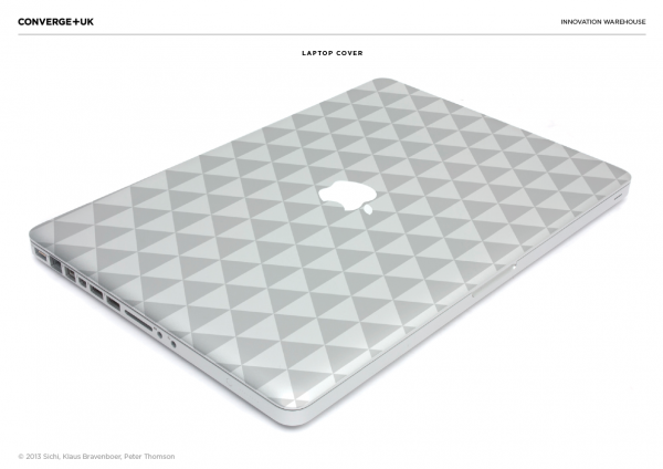
The design system is still being iterated as part of the implementation process. The next step is to roll the design out across print, signage and digital applications. You can read about the process on the Innovation Warehouse blog.
Awesome work, guys.
Truly!