Stage two of the Innovation Warehouse rebranding is to audit the existing brand. We have been asked by the Innovation Warehouse team to share the process publicly so that the community can have input and so that other startups can learn from the experience. Personally, I find that the brand audit is always a slightly touchy phase because it’s early on in the relationship and we’re still getting to know the client. For the process to work, we have to be brutally honest and hold a mirror up to the client and show them what they look like from a customers’ perspective.
The full brand audit (warts and all) is included below with permission from the Innovation Warehouse to help make the branding process more open (and to allow other startups to learn from the process). Some of it is complimentary, some critical and some harsh. But it’s all in the interest of building a solid platform for the new brand. This article is a summary of the management team meeting where we presented the findings of the brand audit. We had identified the key priorities during the briefing in Stage One.
In a full brand audit we don’t just look at the surface of a brand, we go deep and look at the underlying organisation of the business, the product architecture, culture and behaviours. We get deep down into the attributes, values and essence of a brand. Then we look at how that essence is expressed through design. The Innovation Warehouse brand is communicated through copyrighting, logo, colour palette, design, social media and other channels.
This is how we presented the findings to the Innovation Warehouse team…
Strategy Audit
We started the audit with customer interviews. We spoke to resident start-ups and graduates. We interviewed staff members to understand what their daily processes are that bring the Innovation Warehouse brand to life. We have also done a couple of targeted workshops to agree the brand attributes and values and essence internally.

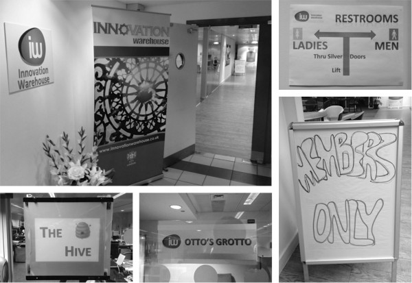
Then we have our own insights. We have the luxury of being able to come here with the beginner’s mind (the eyes of a first-time customer). Some of this is because it really is our first time, and some of it is because it’s the job of a brand strategist to constantly think from the perspective of your audience. Our main day-to-day tool is empathy. We can look around and see all those little things that people who have been here a while have occluded and don’t notice any more. Whether it’s a broken light fixture or rocky chairs; all that type of stuff; all the little pieces which form the overall impression of the Innovation Warehouse.

Our assessment of the Innovation Warehouse’s strategy is that we needs to clarify the vision, market positioning, brand hierarchy and brand architecture. These are common issues but they’re often the root cause of issues that show up on the surface.
Design Audit
The Innovation Warehouse has become a victim of the ‘ship without a rudder’ problem. Innovation Warehouse has ended up with visual chaos and the ethos of the business isn’t coming through. The things that the Innovation Warehouse cares about most just aren’t being communicated to the audience.
Innovation Warehouse was given (possibly through no fault of it’s own) a logo instead of a system. Either you weren’t given a system, or you were, and you didn’t use it. This is common with inexperienced or cheap graphic designers or clients who stop the branding process too early. They get a logo, but not a system to implement it.
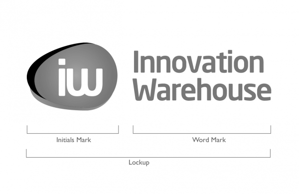
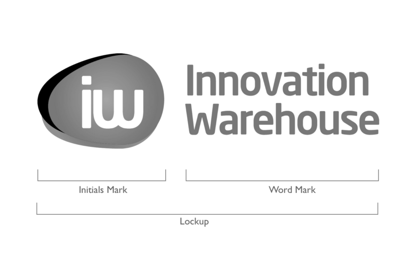
The Innovation Warehouse has an Initials Mark, a Word Mark and a Lockup of the two together. When these marks were created there should have been a set of rules about how they are to be used together, applied to different pieces of collateral, and implemented in practice. There should have been an entire system to support the logo. If anything, the system is more important than the logo itself.
Now let’s put ourselves in the shoes of a first-time visitor to the Innovation Warehouse…
Customer Experience Audit
The first issue is that we can’t find the front doorway. The Innovation Warehouse is down a dark alleyway and the door is hidden because the columns create an optical illusion. Would-be visitors have told us that it’s spectacularly hard to find the Innovation Warehouse. At one point, the official Google Maps location marker was on the wrong street entirely.
There have been heard jokes from the management team such as “It’s like a speakeasy or an intelligence test.” And “If you aren’t smart enough to find us then you aren’t smart enough to join.” This is all in good humour but it hints at an institutional lack of empathy.
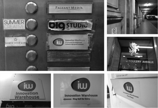
Once we actually find the door, we’re confronted by a confusing intercom system. The label for North Star Law is right next to the button, whereas the Innovation Warehouse label is far away from the button.
I have watched visitors stand outside, afraid to buzz the North Star Law staff because they couldn’t find the button for the Innovation Warehouse. Others tried in vain to press the label itself. The label for the Innovation Warehouse is hard to read because the lozenge shaped Initials Mark is larger than the words. I observed one visitor pull out their reading glasses and peer awkwardly at the whole mess.
The Innovation Warehouse is getting the simple things wrong: user-centred design, clean colour palettes and legible typography. None of these issues are expensive or difficult to get right. It begins with empathy for your customers.
Once we’re through the door, we don’t quite know where to go next. The most eye-catching thing we see in the entrance way is the bright yellow plastic sign shouting “Caution, Wet Floor!” The next largest piece of signage is a giant “IW”. These initials don’t mean anything to us because we have no prior association with them. We are struggling to make out the words Innovation Warehouse, because they are overpowered by this huge and meaningless IW.
Up the stairs, we find a jumble of inconsistent arrows, typography and graphic devices that have been created using PowerPoint, MS Word and even by hand.
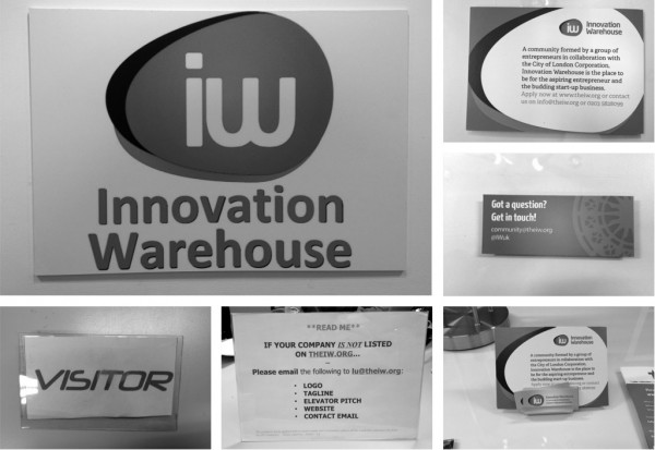
On entering the reception area we find a mix of collateral…
The postcard flyer is quite smart and professional looking. The logo has been reversed out and used as a background. It looks as though it was professionally designed by the person who created the logo. This type of discovery is what I call a “ghost of the design system that could have been”. I think that whoever created this postcard was probably thinking along the lines of a design system, but they never got as far as creating enough templates to ensure consistent implementation of the rest of the system.
The business card has yet another graphic style, which isn’t consistent with any of the rest of what is going on.
The final insult to greet us is that the brightest thing we see is a notice that says “Read Me!” but is, in fact, only relevant to existing members. This is a sign of just how insular the Innovation Warehouse’s outlook has become. This notice has eight different fonts squished onto a single piece of A4 paper. It’s visual anarchy.
After all of that, we are finally handed a visitor’s name card which is printed on pink paper with a weird, blue font from the movie “Tron”. Half of the name cards are coffee stained, torn or battered. Finally, we are welcomed into the co-working space for our meeting…
The audit stopped there, but the customer experience inside the co-working space isn’t much better.
Find out how the Innovation Warehouse team responded to the audit. Read the other chapters in the Innovation Warehouse Rebranding Live Case Study and follow the story on the Innovation Warehouse’s own blog as well.
You can also give us feedback and input by commenting on the blog posts or tweeting @IWlondon.
This is brilliantly funny in retrospect 🙂 Thanks for writing this! Can’t wait to see the ‘How IW improved on this critique’ blog post :-“
I got lost because East Poultry Avenue isn’t listed on the map at the start of Smithfield Markets (in Cowcross Street).